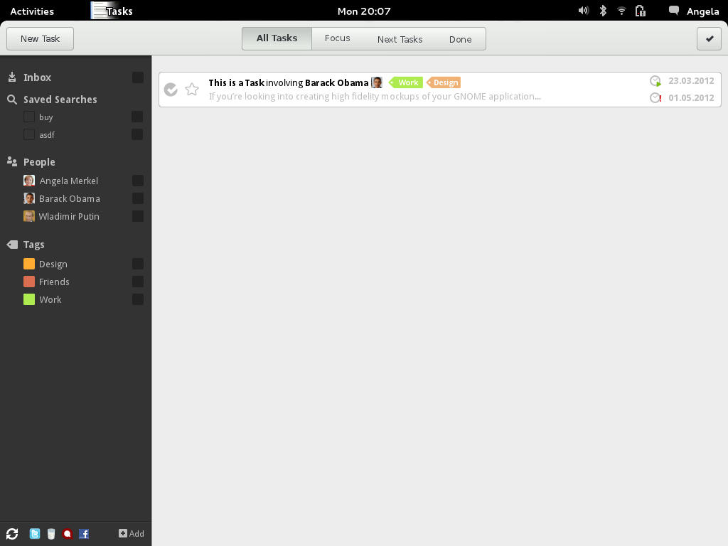
Design (old)
16. March 2012
Changelog:
- Font is now the standard ‘Sans’ Font
- Increased width of the sidebar
- Some margin and padding fixes
- Noisy background
- Tag Options with new Color-Picker dialog
- Increased hight of the elements in the left sidebar to 28px
Layout
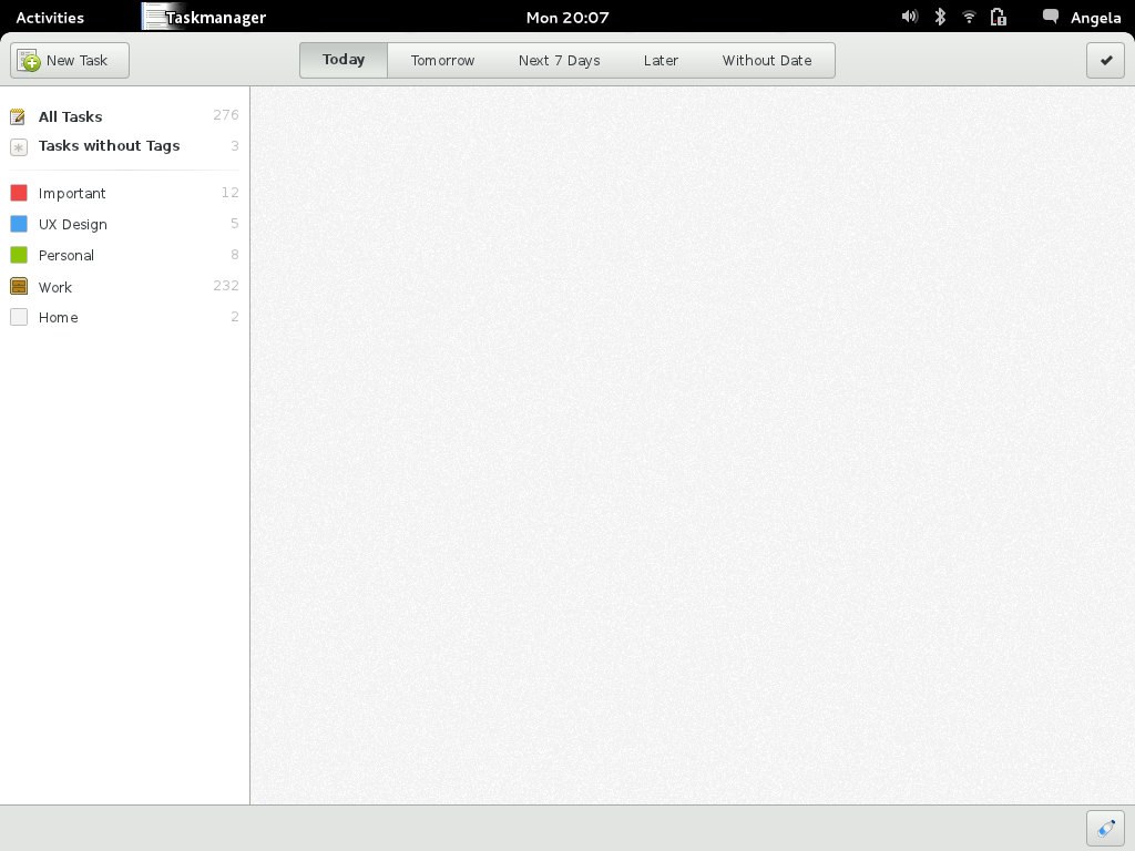
App-Menu
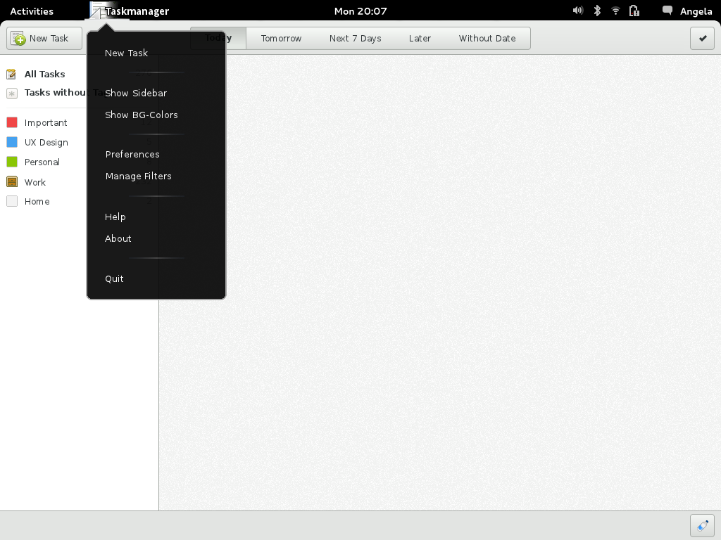
Tag Options
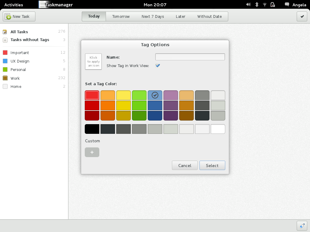
Primary Bar Filters
- Only time-releated (like Wunderlist)

- time- and mode-related filters mixed

- Again mixed (‘Today’ would behave like the current ‘Work View’)

Tasks
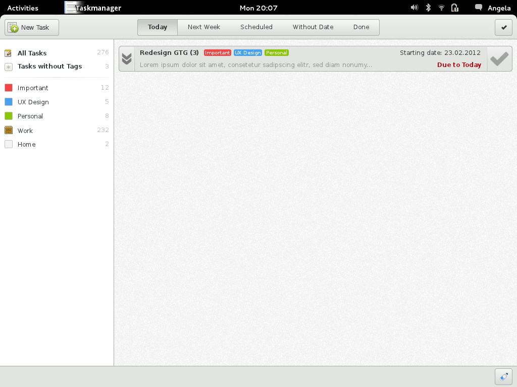
18. March 2012
Changelog:
- Ditched the noisy background
- Changed some colors
- Redesigned the Tasks
- Added some visual sharpness
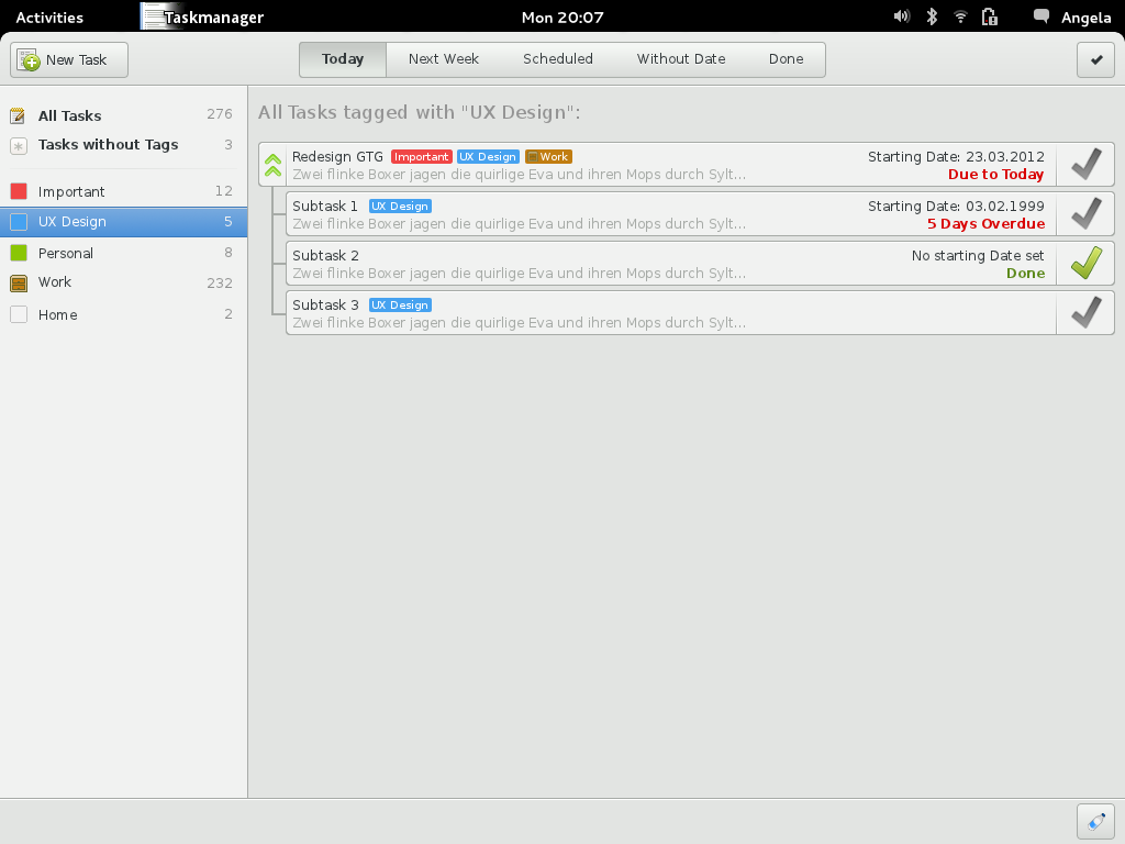
8. April 2012
The manifesto goal #1 states, that “it makes sure you never forget anything and you never miss a deadline.”. This is not the case, since i have to remember to open GTG in order to get remembered of my tasks. I wouldn’t call this “never”. I think GTG needs a deamon, which starts on computer startup and tries to remind you of your tasks, even if GTG is not opened. This deamon should be fully integrated in the Gnome 3 Desktop. It should show you your next Tasks in the calendar applet and it should be able to make notifications 30 to 60 seconds after the computer start.
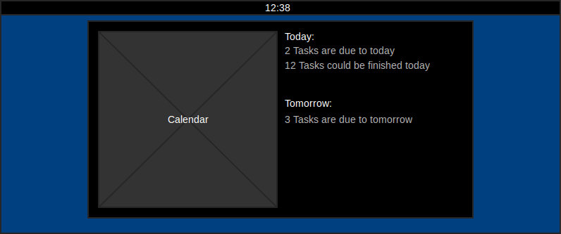
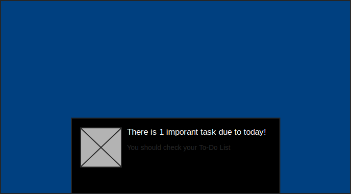
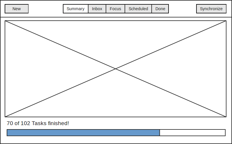
The first wireframe shows the new start screen (Summary), which aims to achive manifesto goal #2 “Focus on what’s relevant” and goal #4 “Avoid procastination”.
The start-screen contains information about the most relevant tasks depending on your time and deadlines. It should also show something that motivates the user to get tasks done. The start screen provides an overview of my current situation. I can easily see how much tasks i should do today and how much I’ve already completed. It could also contain some motivational phrases.
The Start Screen concept isn’t finished yet, because i’ve read a nice book about game machanics and want to try to get some of these into GTG, to make it fun to complete tasks.
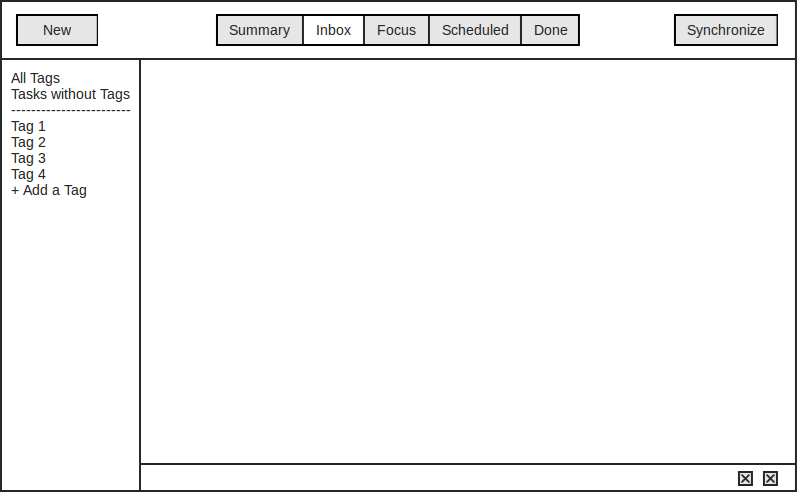
The second wireframe shows normal state, with primary toolbar (top) tag-sidebar (left) and plugin-toolbar (bottom).
Inbox View: The Inbox-view contains all tasks, imported from other to-do programms, such as Remeber The Milk etc. If you add notes, assign dates etc. the tasks get moved out of the inbox.
Just an Idea: It would be great if you would be able to send yourself emails with a special subject (e.g. “@GTG: My Task”) which would then land in the Inbox for further editing.
Focus View: The Focus-view behaves like the current work view. Scheduled: This view shows you all your tasks in a chronological order. Done: This view shows all tasks, marked as done
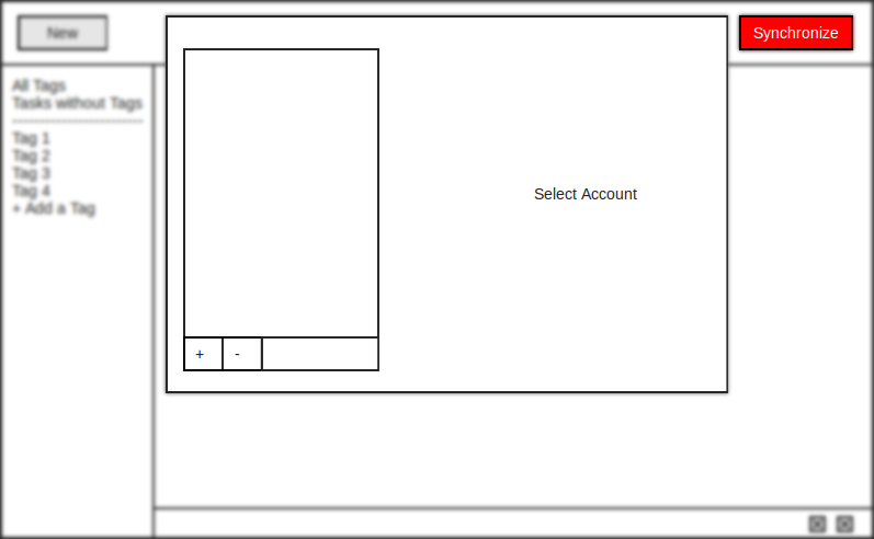
Since i wanted to focus on synchronization-abilities, i moved the sync-button to the right side of the primary toolbar. If you klick on this button the first time, it will open an account selection dialog, where you can enter your account details of external services. It should maye show some text, which explains all the sync-stuff and tell you, that you can add more accounts later in the options
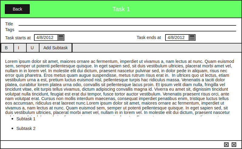
Edit View: The idea is, that GTG would handle tasks, like other Gnome 3 apps handle files. If you click/tap on a task, it will open the edit-view, where you can edit your tasks, set another title, tags and dates.The
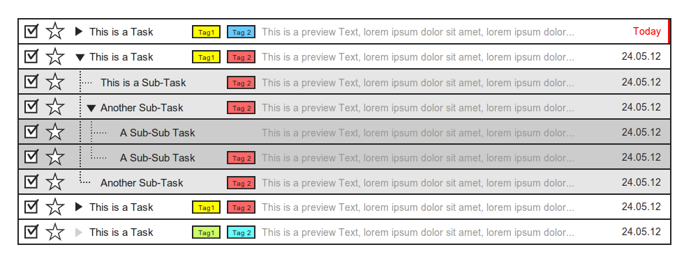
The Task Design:
My current approach is highly “inspired” by Gmail, but i think this is a very nice way to display the tasks.
The hight of a single task should be around 40px, so its easy to target on touch devices. The first three buttons are “Mark as done”, “Priorize” and “Expand/Collapse”. I hope the rest oft the design is self-self-explanatory.
For the sub- and sub-sub-tasks, i used darker shades of grey, to symbolize, that you are going deeper in the hirarchy.
I know, there is no extra place for a starting date, but if there is a starting date assinged and the task hasn’t started yet, we could just display “Starts at:” instead of the due date.
15. April 2012
